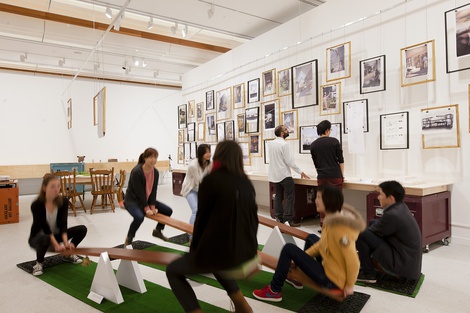
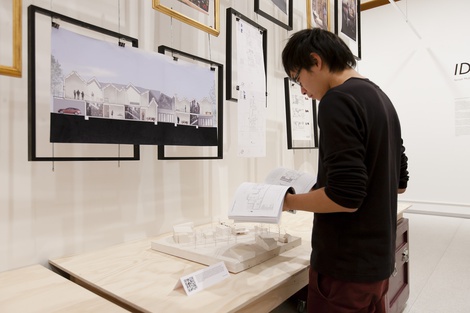
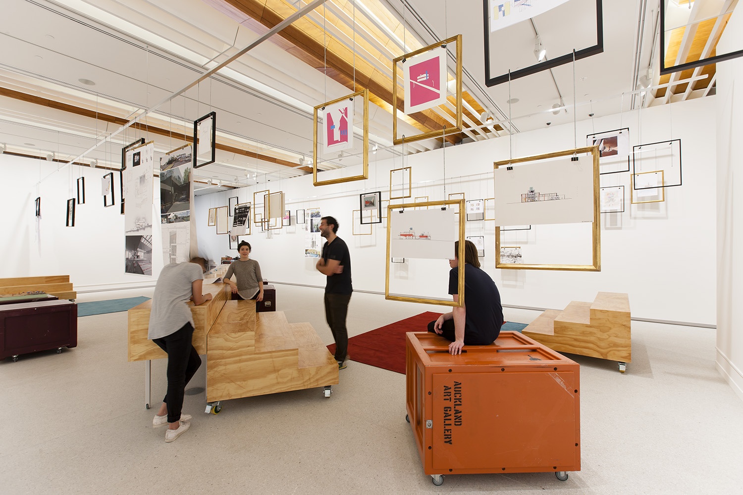
The Lab was a joint project between the architecture and spatial design faculties of AUT University, The University of Auckland and UNITEC. These institutions worked alongside students, local academics, designers and architects to develop a series of two to three week-long interdisciplinary design projects.
Sarosh Mulla, one of the founders of design collective Oh.No.Sumo, will create a specially designed installation exploring the Kiwi ‘quarter-acre dream’.
Tuesday 21 May – Monday 10th June
8 posts
Student outcomes I – David Duan
The Ideal Home(land) studio is wrapping up and while the student’s final outcomes have been developed individually, there are many common features among the designs such as shared libraries and productive gardens. But despite these recurring elements, there’s also a lot of variety in the way the site and brief were approached, with each student’s personal ideals beginning to show through.
Designing for higher density means designing for a greater number of people living in a smaller area, and so the students are designing the way that these residents will relate and interact with one another – designing a sort of social landscape which is shaped by the physical structures.
Understanding that at different times people want to interact with the landscape in different ways, David Duan‘s proposal has a number of openings onto smaller outdoor spaces, as well as a shared, larger courtyard. Combined with the form of the buildings and their detailing, these are small scale, private, and thoughtful spaces. Scattered around the building, these are cleverly arranged so that residents are never too far from an outdoor space.
These are well-defined little terraced areas which open out, and because of the way they peek out from the shelter of the building, they can still be used when the weather is a little drizzly. This is a key consideration with Auckland’s mild climate but temperamental weather.
The next two posts will look at some more student proposals, highlighting the range of ideas generated in the Ideal Home(land) studio.
By Emma Ng
Student outcomes II – WooMin Lee
WooMin Lee really looked at this project with an emphasis on designing a social landscape, interested in connecting up the smaller spaces to increase the number of social interactions across the building.
Tackling the idea of subdivision at its root (dividing space into smaller and smaller spaces), WooMin’s proposal attempted to connect these spaces, particularly through access routes. The hope is that the architecture encourages a flow of people through the spaces, in turn offering the residents of the site opportunities to meet and interact as they go about their day.
The design is made up of four houses, multi-storied and one on each corner of the site. The buildings are connected by an elevated bridge structure, and the functions that the building offers are broken down into three sort of ‘sharing zones’ – the residential, the communal, and the neighbourhood. Communal building facilities such as a laundry and daycare are on the first floor all accessible via the bridge. The ground floor is designed to cater for not only the residents of the site, but to bring in the neighbourhood. The buildings open out onto a central courtyard, providing outdoor space, and also house ‘neighbourhood’ scale things like a café.
The building therefore not only encourages circulation of the residents around the site, but the circulation people around the neighbourhood. This sort of social landscape understands that part of creating an efficient building is encouraging the use of every single part of the space, and encouraging a lot of movement around the building is a step towards this.
WooMin’s proposal also presents itself as a kind of ‘new villa model’ – just as the suburb is currently populated by many variations of the villa which gives the street a certain unity through variations on the one model, WooMin also considers the possibility that her building could be a model for other sites in the suburb, with slight variations. In terms of housing affordability too, this could be an effective way to design and build for affordable higher density, avoiding the higher costs of one-off bespoke architecture.
With the neighbourhood level spaces on the ground floor, one can imagine the circulation of people around several such buildings in the street with each site offering a different mix of businesses and services. What this proposal offers is a halfway step – a design which steps cautiously toward higher density housing, carefully considering its social implications and opportunities.
By Emma Ng
Student outcomes III – Hannah Steenson
Hannah Steenson’s proposal is in many ways a contrasting solution to WooMin Lee’s. Grounded in detailed research into different conceptions of the ideal home as it has shifted and changed over New Zealand’s history, Hannah’s proposal combines successful parts of several previous ideals to present something which offers privacy and space (elements which have come to signify luxury) in a high density building.
From the exterior the building presents itself as one large home, making unclear the boundaries of each private home within and giving the impression of a ‘modern mansion’. The upper level of the two storey building gives views of the tree tops and the nearby park, providing the outlook onto the landscape that has become so desirable in contemporary New Zealand homes. The building has a number of outdoor ‘pockets’ scattered throughout. These smaller openings are little refreshing moments, breaking up the interior spaces of the building, creating a visual flow between interior and exterior.
The proposal is very much a one-off piece of architecture, highly attuned and specific to both the imagined residents and the site. The height of the structure is varied to match the height of the surrounding buildings and scales down toward the street. Here a smaller, sheltered entrance brings the residents together as they enter and exit the site. Inside, the building is designed to offer both moments of privacy, tucked away behind the angles of the building, and also opportunities for the residents to come together. Each home has an individual kitchen and living space but these are situated next to each other and can be opened out to create a larger, shared kitchen.
As Auckland moves toward higher density there is a place for architecture like this. With its interesting and thoughtful outdoor spaces, buildings like these have a part to play in attracting the upper end of the housing market to higher density housing. Auckland will need housing of all kinds, including desirable smaller residences that offer privacy, luxury, and landscape views, while also offering the opportunity to live close to shops and cafes as part of a lively neighbourhood.
By Emma Ng
Gary Lawson – Works in progress


Lucas Doolan
Read more
Designing for difference
The Triennial brings in inspiration, provocation and ideas from all directions, and in its first week there were lots of talks given by Triennial participants.
Read more

